Make Your Own: Vanya’s Autobiography from The Umbrella Academy
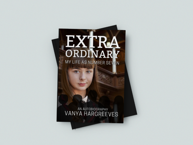
When I’m not writing tutorials for Carbon Costume, I’m freelancing as a graphic designer. One of my favorite types of design projects is book covers. In this post, I’ll show you how to turn almost any hardcover book into your very own edition of Extraordinary, Vanya Hargreeves’ autobiography from Netflix’s The Umbrella Academy, to be paired with this Vanya costume guide. You can apply these same techniques for any made-up book cover you need as a cosplay prop!
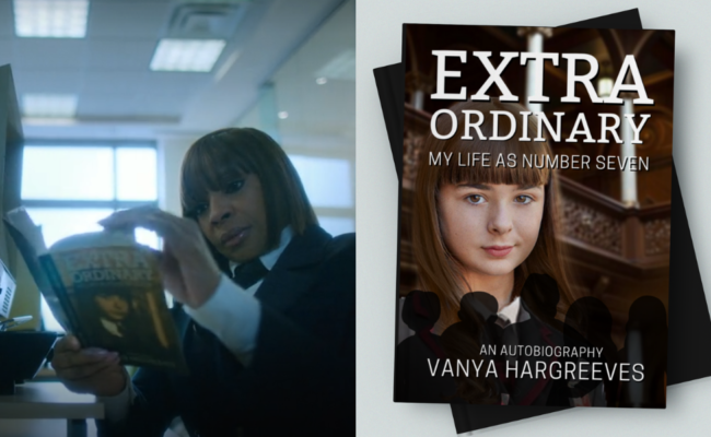
In the show, Vanya writes this book to the chagrin of her six adopted, superhero siblings, about her experiences growing up in their collective shadow as the only child who did not have any superhuman abilities. You can use this as a costume accessory if you’re cosplaying Vanya, or any other character from the TV series who seems like they might have read her book (even if they won’t admit it).
For this project, we’ll be using my favorite free, web-based graphic design program, Canva. It’s quite easy to set up a Canva account, and it’s got an incredibly user-friendly interface so even beginner designers can have fun creating visual art. (My biggest pet peeve with the site is they passive-aggressively push a lot of premium features – it’s easy to accidentally select a premium font or image, only to get hit with a “you need to pay for this” message when you’re about to save out your design. Just look for dollar or crown signs next to fonts or graphics before selecting them.)
Things you’ll need for this project:
- Color printer and printer paper
- Free Canva.com membership
- Custom graphics (see Step 3)
- Scotch tape (optional)
- Clear contact paper (optional)
Reference Images
Before we get started, here are some screencaps from the show of Vanya’s book, close-up.

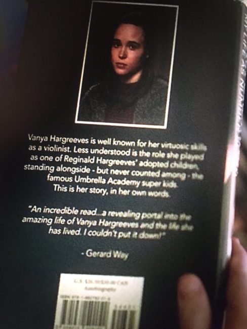
Anyone else notice that Gerard Way, the co-creator of the Umbrella Academy comics, wrote an accolade on the back of the book?
I will be using these two images as references, and I’ll do my best to re-create some of the more “complicated” elements of this design (e.g. a picture of Vanya as a child, wearing her Academy uniform) using my passable photoshop skills, so you don’t have to. :)
Step 1: Taking Measurements
Find a paperback book with an intact dust jacket that you own and don’t mind using for this project. We won’t be cutting anything up, just taking detailed measurements and totally upstaging some professional graphic designer’s work with our new dust jacket!
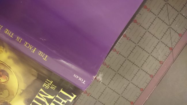
Completely unfold the existing dust jacket, lay it perfectly flat, and take the following measurements:
- Total width and height of the dust jacket (in my case, it was 20″x8.5″)
- Cover width and height (6″x8.5″)
- The two jacket flaps’ width and height (3.5″x8.5″)
Step 2: Canva Setup
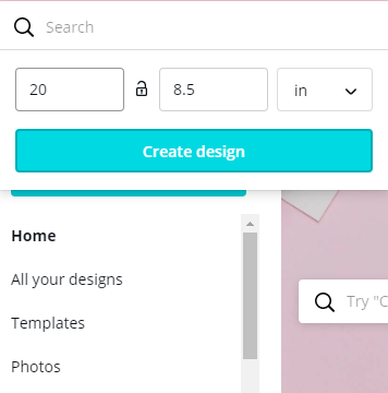
Log on to Canva.com (create a free account if you haven’t already), and create a design with custom dimensions that are the total width and height of your book’s dust jacket.
Using a rectangle element from the Shapes collection (accessible under the Elements tab on the lefthand size), you can mark off the different sections of your dust jacket, colored for demonstrative purposes: the front and back cover panels (blue), the dust jacket flaps (red), and the spine (yellow).
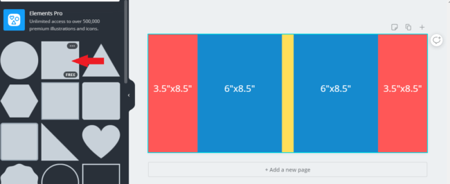
If you’d like, you can create each panel (the cover, the flaps, etc.) in their own Canva design file, save each component out into its own image, and assemble each finished component together in a design file sized to be the full width and height of your dust jacket at the end. That’s completely up to you.
Step 3: Photoshopping Custom Graphics
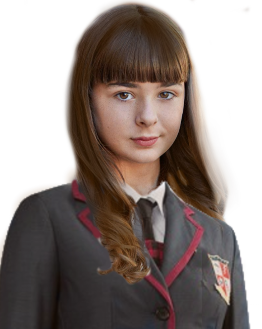
Graphic design is not everybody’s forte, so I’ve decided to make a few steps of the process a little easier. As I mentioned before, I’m going to recreate a few elements from the cover art, like Vanya’s cover photo of her child self.
First, I found a headshot photo of the teenage actress who played young Vanya from the Umbrella Academy Wikia page. Then, I found a product image of a replica Umbrella Academy student costume. I also discovered this excellent trove of set and prop photos in Tribute.ca‘s article about the series’ filming. In particular, this photo of the Hargreeves’ beautiful house was of great use.
Using GiMP (a free alternative to Adobe’s Photoshop), I produced this image to the left of Vanya as a young Academy student. My work is definitely on the scrappy side here, but it blends with the background pretty well. If you’re a Photoshop wiz and you’d like to do better, I’ve linked the source images above so you can create a better one.
Step 4: Designing the Front Cover
In the right-most blue, 6″x8.5″ panel, I started assembling the cover art. (Alternatively, you can create this panel separately in a new Canva design file of the cover panel’s dimensions.) First, I made the blue rectangle completely transparent, and locked it in place so that it serves as a guide for centering the elements. The cover image’s background is the set image of the Hargreeves’ house. Click on the image, crop it to the dimensions of the rectangle guide, and select the “Adjust” feature in the upper left – set “blur” to around level 5.
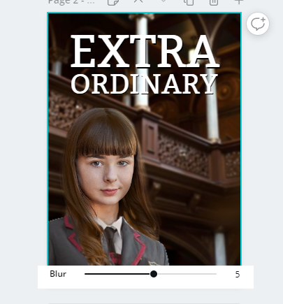
Here’s how I created the drop shadow for the title text, giving it that extra level of “pop” and contrast against the background.
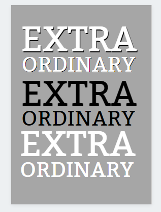
Canva’s font library includes a variety of free and premium fonts. I selected one of the free ones that looked similar to the original. In one text box, I typed the word “EXTRA” in all caps; in the second, I wrote “ORDINARY.” Dragging in the upper right corner of each text box allows me to adjust the font sizes and scale them to the desired proportions.
To give the text a bit more “pop” and contrast, I colored the first text group black, and duplicated them in white. I positioned them slightly upward and leftward of the black text to give the illusion of a drop shadow.
I did the same with the subtitle and author name text, in the font “Cooper Hewitt” in all caps (and, if you want to get extra complicated, I adjusted the spacing between the letters to 53).
Lastly, because I forgot until that point, I added five generic graphics of people’s silhouettes that I found in Canva’s free Elements library, and made them slightly transparent. (Why there aren’t six of them, as Vanya is the seventh child, is beyond me.)
Adjust all of the front cover elements as you see fit, until you’re satisfied that they match the reference images.
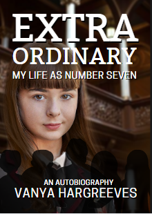
At this point, I was happy with my work, and ready to move on to the next step in the design.
Step 5: The Back Cover
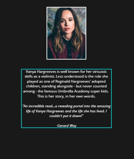
For the back cover, it’s a much simpler layout. All you need is a photo of Ellen Page (Google Images is your friend) and a copy of the “blurb” (book description) text. (It should be noted, I turned the blue, red, and yellow guides transparent and went with a dark, almost black canvas background color for the dust jacket. The hex code for the specific color I used is “#191919.”)
In the Elements drawer on Canva, I looked for a rectangular picture frame with a white border as the setting for Vanya’s author photo. I went with a somber-looking headshot of Ellen Page that looked similar enough to the onscreen reference.
Using a sans-serif font (such as “Open Sans”), I added a text box below to input the blurb text — which I transcribed from the blurry reference photo, so you won’t have to:
Vanya Hargreeves is well known for her virtuosic skills as a violinist. Less understood is the role she played as one of Reginald Hargreeves’ adopted children, standing alongside – but never counted among – the famous Umbrella Academy super kids.
This is her story, in her own words.“An incredible read…a revealing portal into the amazing life of Vanya Hargreeves and the life she has lived. I couldn’t put it down!”
-Gerard Way
If you want to be a little extra, you can put a fake barcode and ISBN number below Gerard Way’s accolade. You can find a fake barcode clipart image online, if you wish.
Step 6: The Center Spine
My last finishing touch to this design is to add text to the center spine (the side of the book with horizontal title text, which faces you when shelved).
Please don’t sue me, Dark Horse!
Insert a new text box with the book’s title into the center of your design, and use your mouse to rotate the text ninety degrees sideways. The snap-guides (pink lines) should help you center it to the very middle of the design. (You’ll want to make sure there is ample space around the text so that it won’t look cut off when the dust jacket is fully folded on your book.) Do the same with the author’s last name, but in a smaller font size – it’s up to you whether you’d like it above or below the title.
To be extra extra with this design, you can also include a publisher’s logo. As a homage to Dark Horse Comics, the original Umbrella Academy comic’s publisher, I went with their logo.
In this case, I elected to leave the jacket flaps completely blank. If you’d like to get creative and write a detailed blurb, have at it. Some generic “lorem ipsum” text would probably work in a pinch as well. (If you’re trying to save on printer ink, you can also color the flap panels white as I did. They’ll be hidden when the jacket is folded over.)
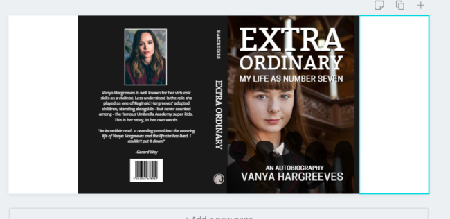
When you’re satisfied with how your design looks, you can save it out as a print-ready .PDF file (no crop marks or bleed needed), or a .PNG file.
The design can be printed out in parts on a standard home/office printer, using 8.5″x11″ paper, and assembled using tape and covered in a sheet of clear contact paper for evenness and durability. Alternatively, you can see about getting it printed professionally on one sheet at your local print shop or department store photo center.
However you go about it, this is what you should end up with:
There are no comments yet, add one below.
Stay connected. Don't miss out!
Get new costume guides in your inbox once a month.
 Carbon Costume
















Leave a Comment